01 · Bespoke Metrics · 2024–2026

COMPASS

COMPASS looked like a legacy platform, and states nobody used were bloating the codebase. The redesign gave it a modern facelift and trimmed every component to the states we actually need, so one set could be shared across Storybook and the codebase.

Before and after

Legacy components beside their documented replacements.
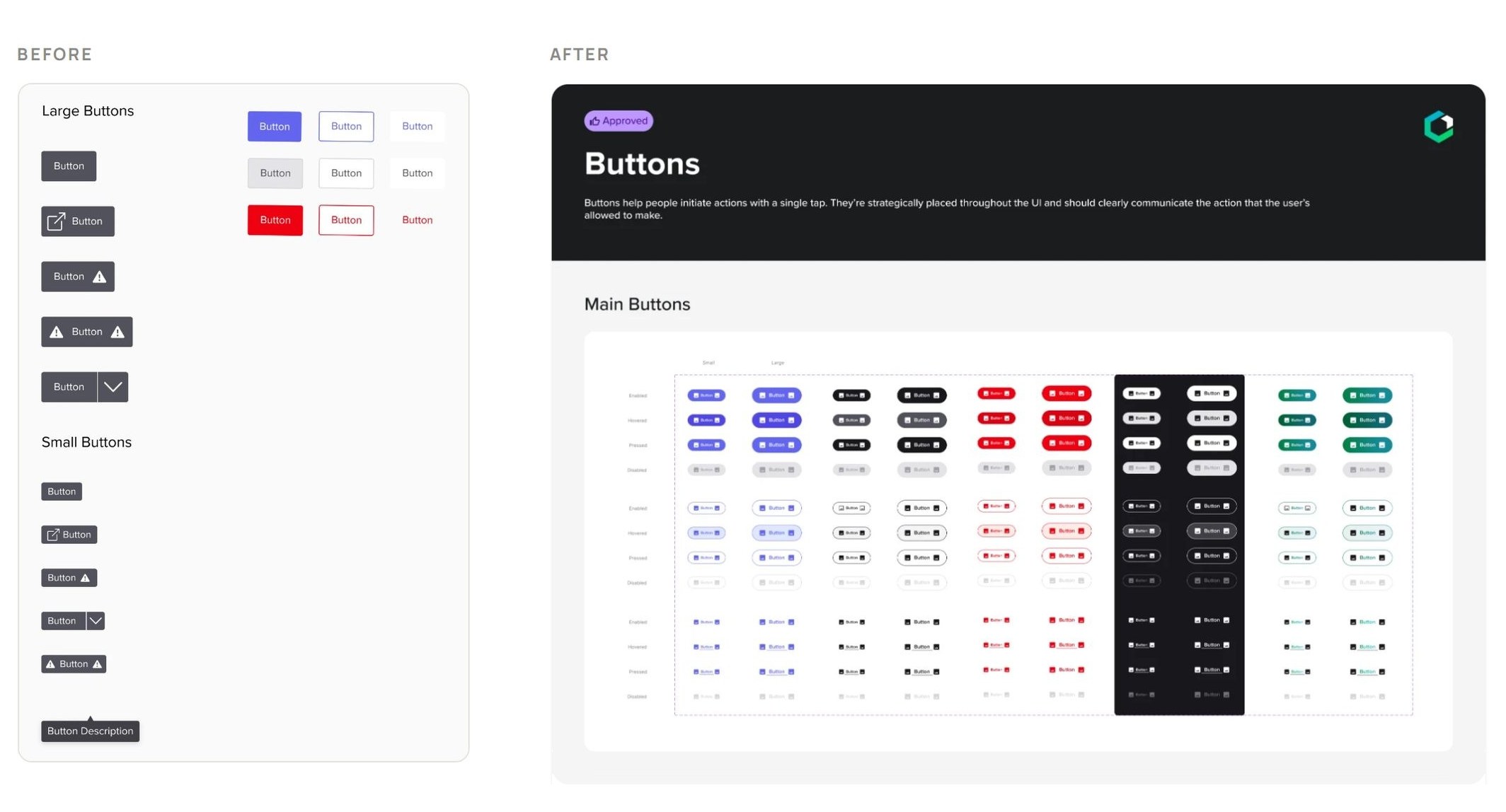
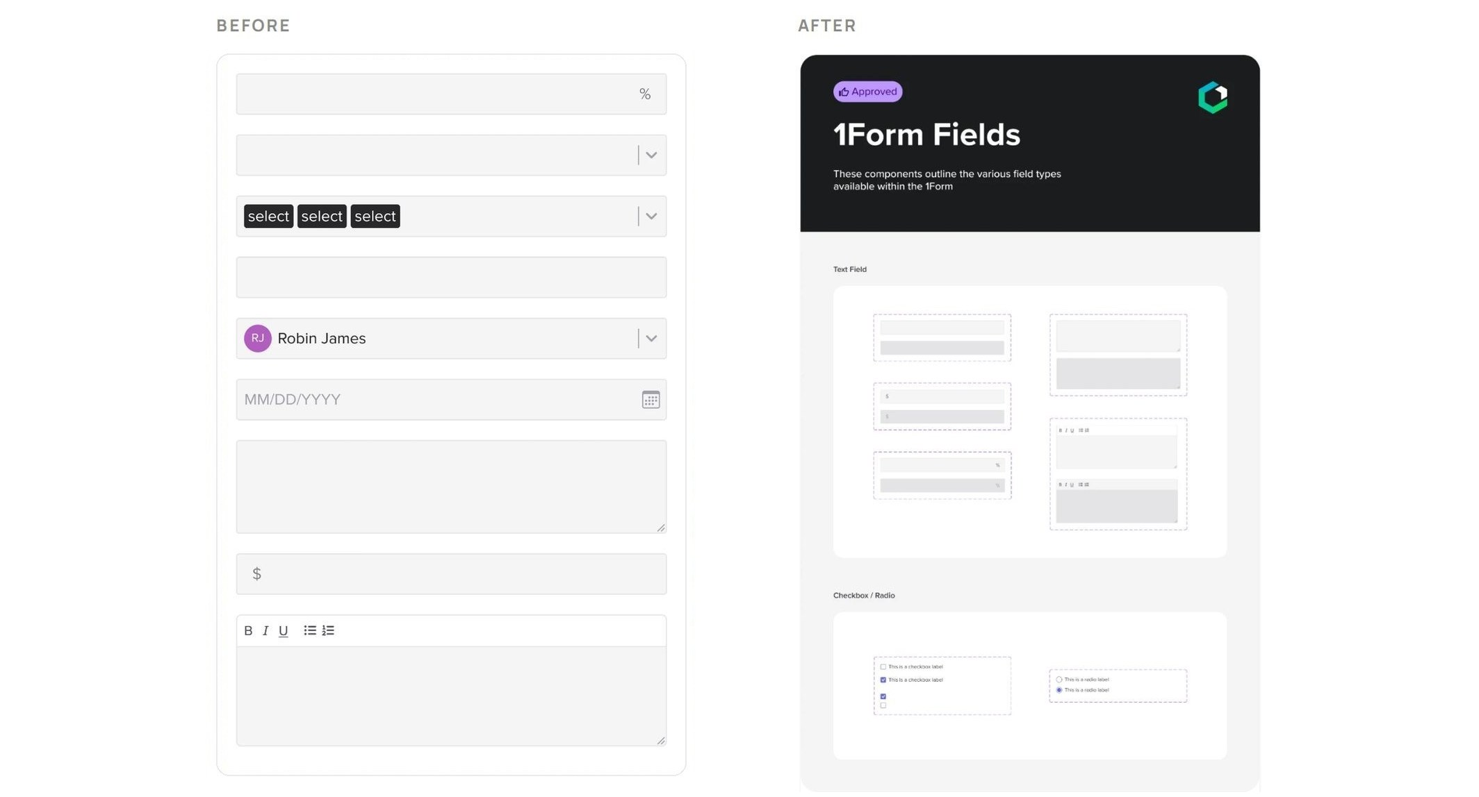
Buttons before and after: legacy buttons beside the documented button setForm fields before and after: legacy fields beside the documented 1Form fields

Actions

One button anatomy, four colours, three emphases, two sizes.
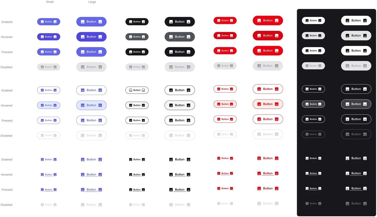
Main buttons: Filled, outlined and text × enabled, hovered, pressed, disabled
Main buttonsFilled, outlined and text × enabled, hovered, pressed, disabled
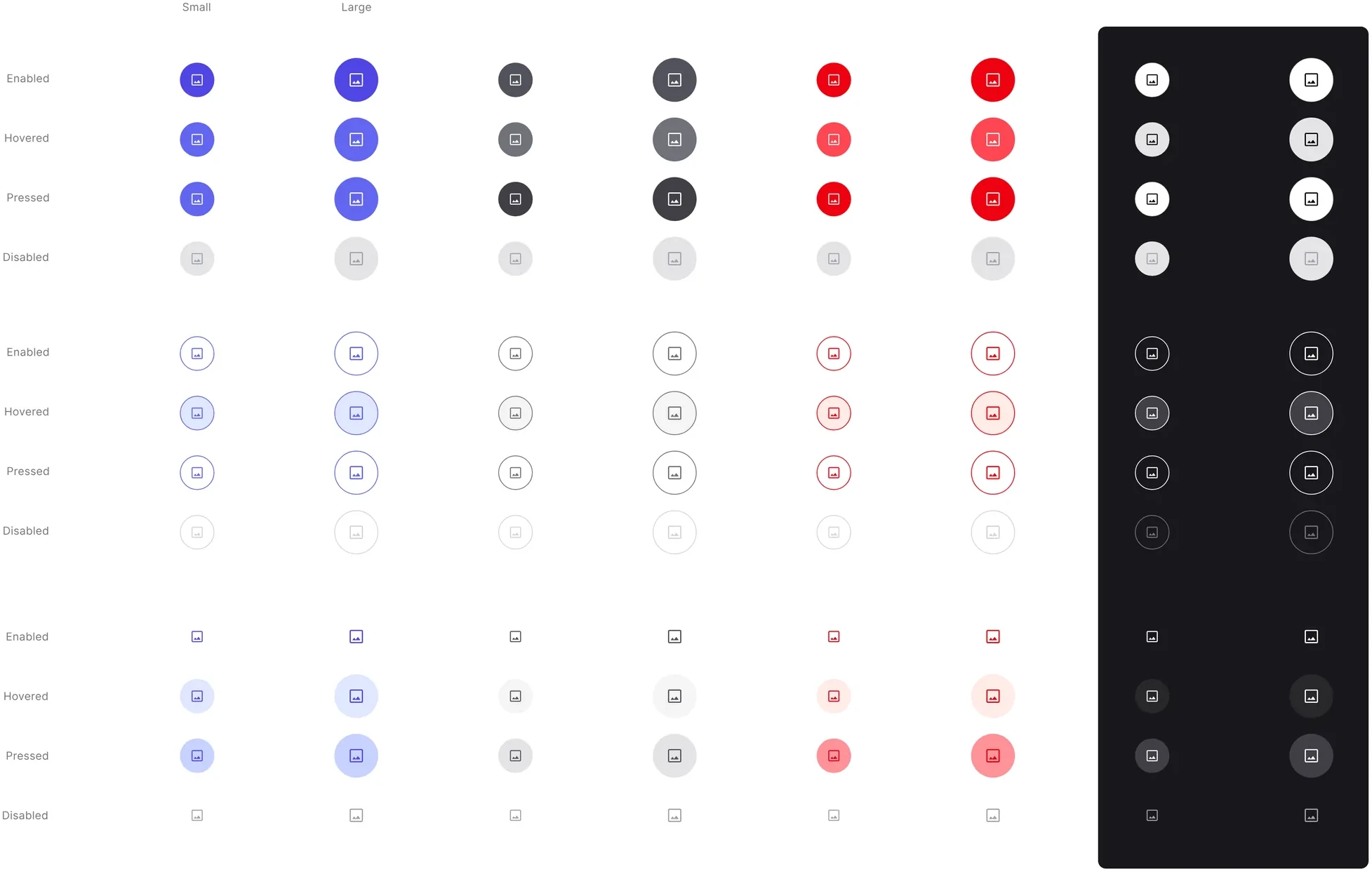
Icon-only buttons: The same matrix without labels, for smaller breakpoints and simpler actions
Icon-only buttonsThe same matrix without labels, for smaller breakpoints and simpler actions
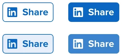
Share buttons: Outlined and filled, small and large
Share buttonsOutlined and filled, small and large
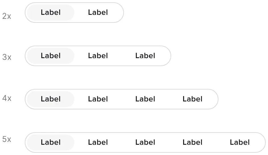
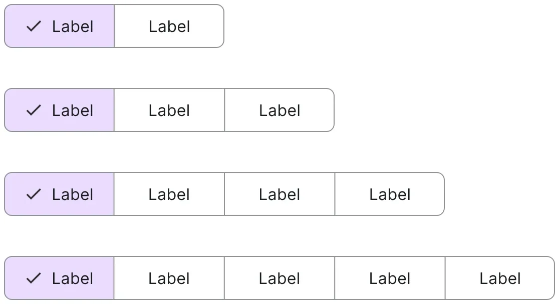
Segmented buttons: Two to five segments
Segmented buttonsTwo to five segments
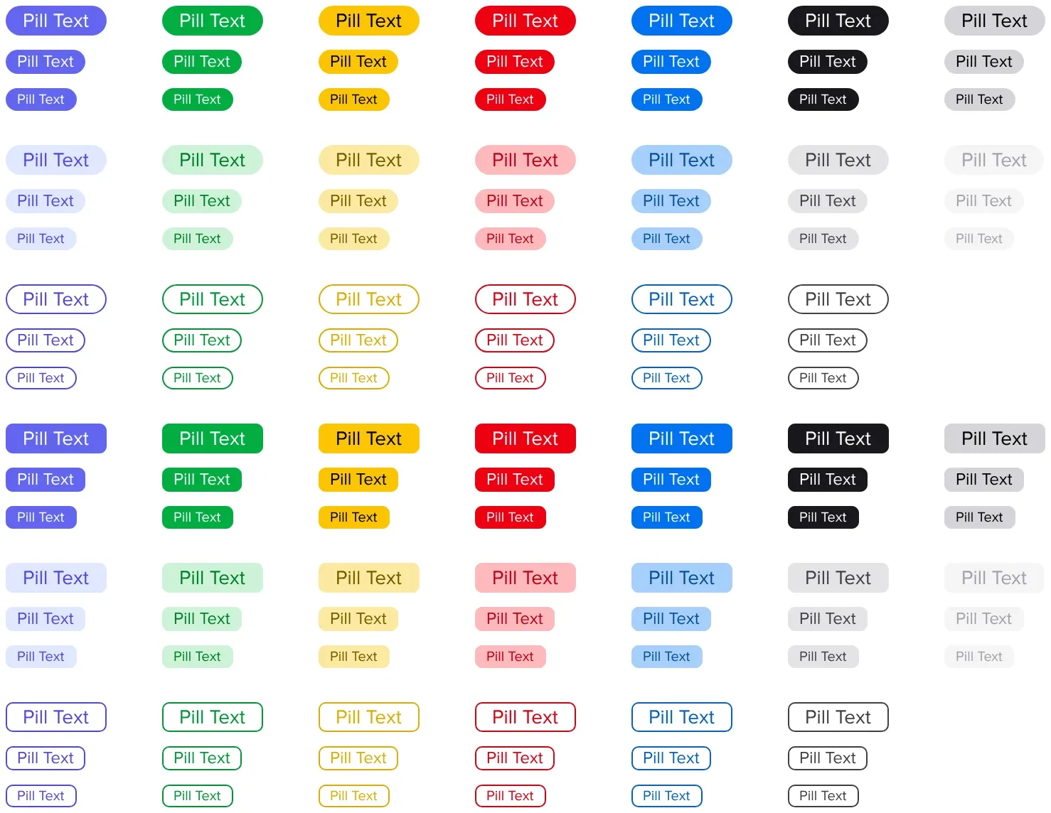
Pills/tags: Status pills and tags in every brand and system colour, for project, status and tag customization
Pills/tagsStatus pills and tags in every brand and system colour, for project, status and tag customization
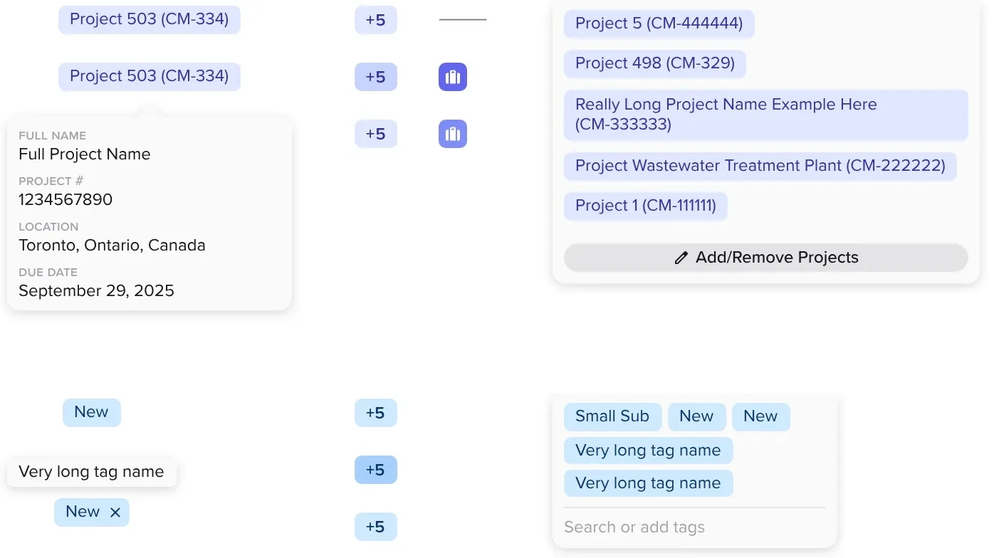
Tags in context: Projects and tags: default, hover, removable, overflow and the dropdown
Tags in contextProjects and tags: default, hover, removable, overflow and the dropdown

Inputs

The 1Form, where subcontractors spend most of their time.
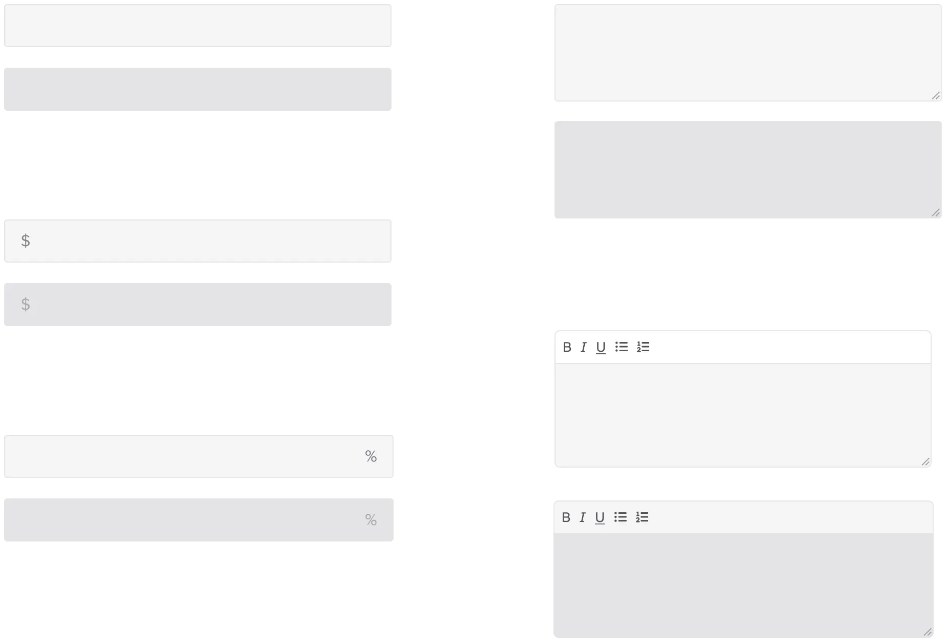
Text fields: Single line, multi-line and with helper text
Text fieldsSingle line, multi-line and with helper text
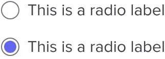
Radio: Unselected and selected
RadioUnselected and selected
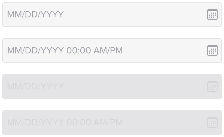
Date and time: Empty, filled, disabled
Date and timeEmpty, filled, disabled
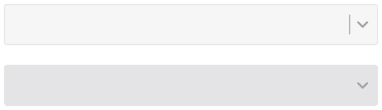
Select: Enabled and disabled
SelectEnabled and disabled
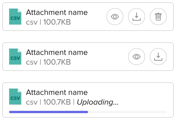
Attachments: Uploaded, with actions and uploading
AttachmentsUploaded, with actions and uploading
Add file: Enabled and disabled
Add fileEnabled and disabled

02 · Produktiv · 2023–24

Produktiv

Produktiv needed a new website to show the agency’s work. The system turns every project into reusable components, so engineers and other designers can publish new work as it’s completed without designing a page from scratch.

Foundations

The tokens everything else is built from.
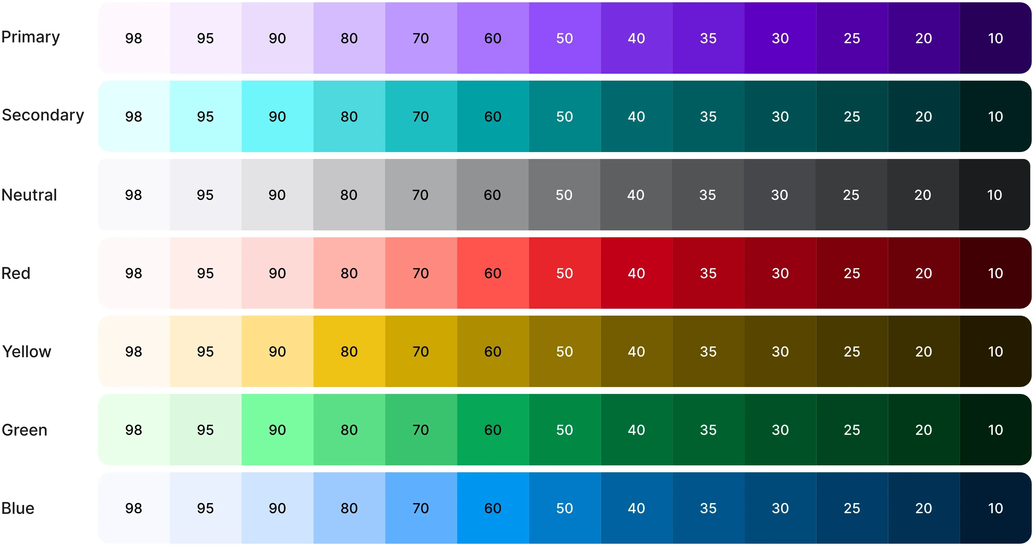
Colour: Brand and system ramps, 10 to 100
ColourBrand and system ramps, 10 to 100
Display face
Display face
Text face
Text face
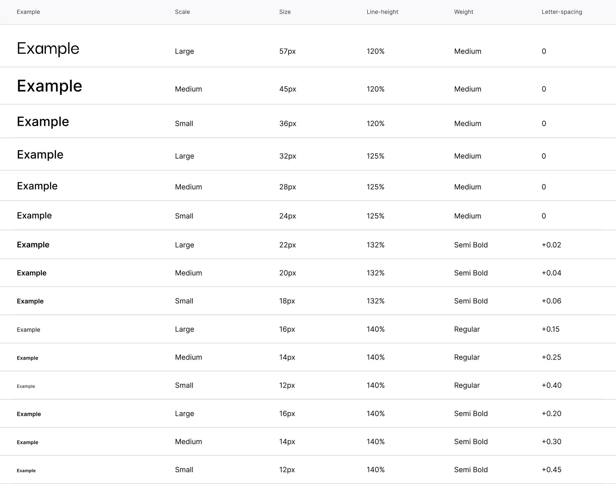
Type scale: Different text sizes and weights to create a strong hierarchy throughout the website
Type scaleDifferent text sizes and weights to create a strong hierarchy throughout the website
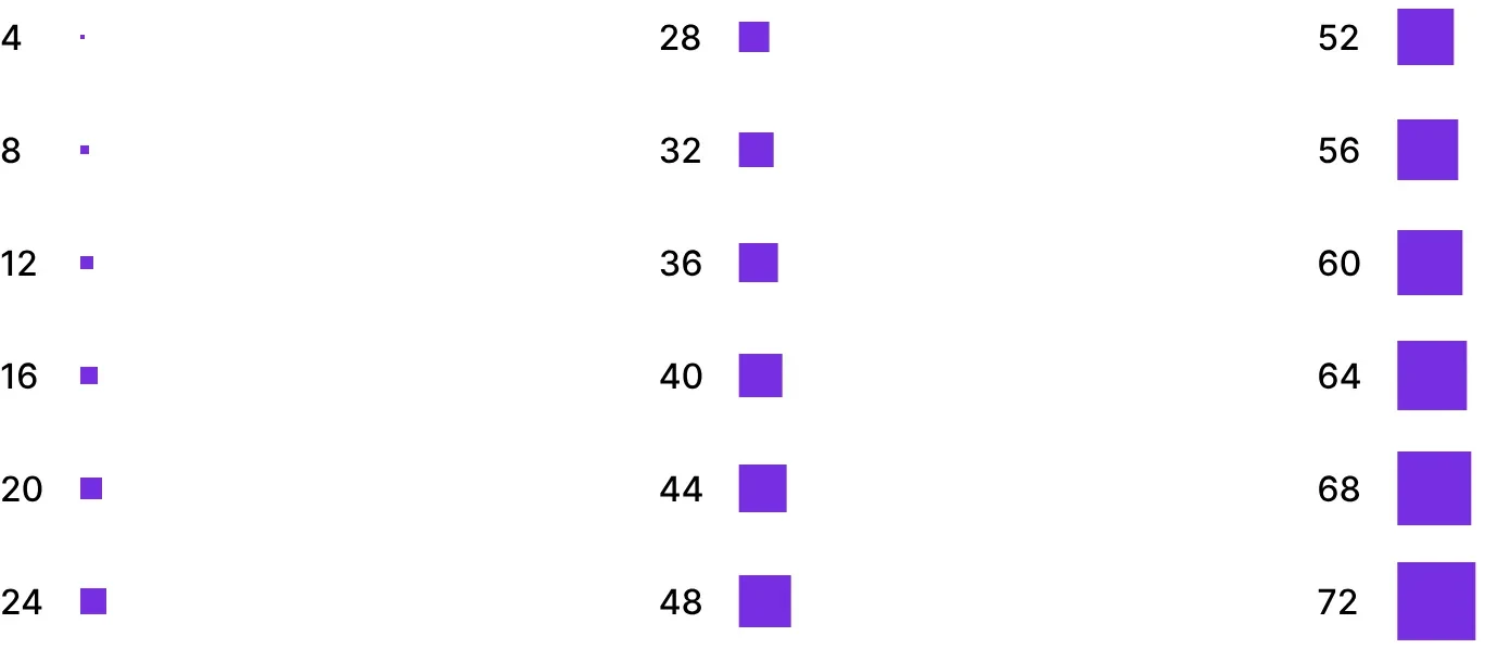
Spacing: 4pt steps, from 4 to 72
Spacing4pt steps, from 4 to 72
Elevation: Five shadow levels for different component depths
ElevationFive shadow levels for different component depths

Documentation

Every component gets a page: status, purpose and the full state matrix.
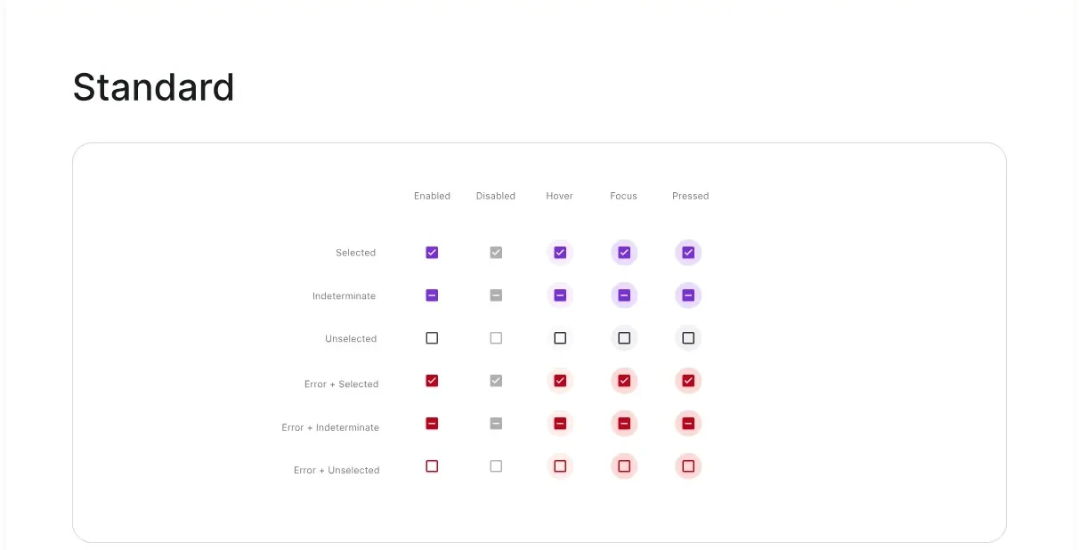
Checkbox page
Checkbox page
Text field page
Text field page

Actions

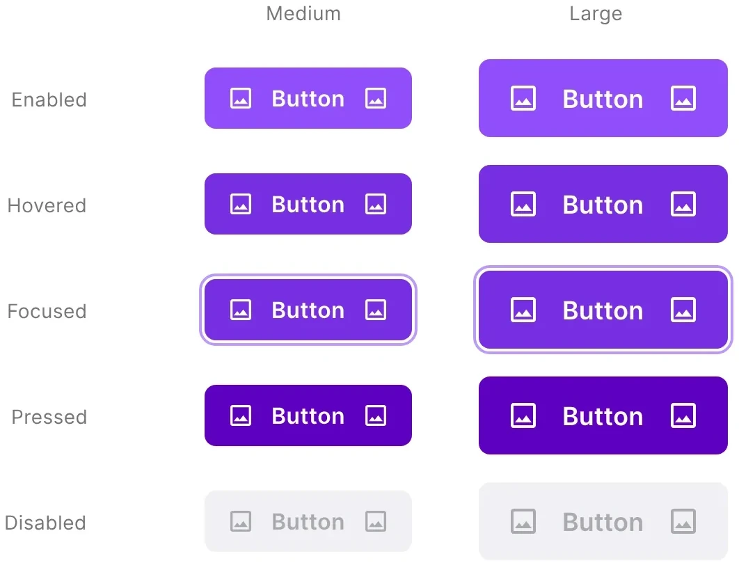
Filled button: Medium and large × five states
Filled buttonMedium and large × five states
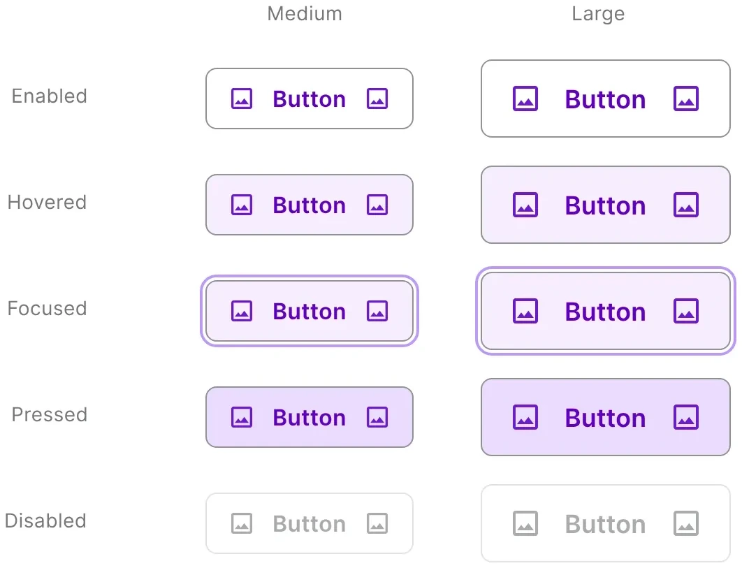
Outlined button
Outlined button
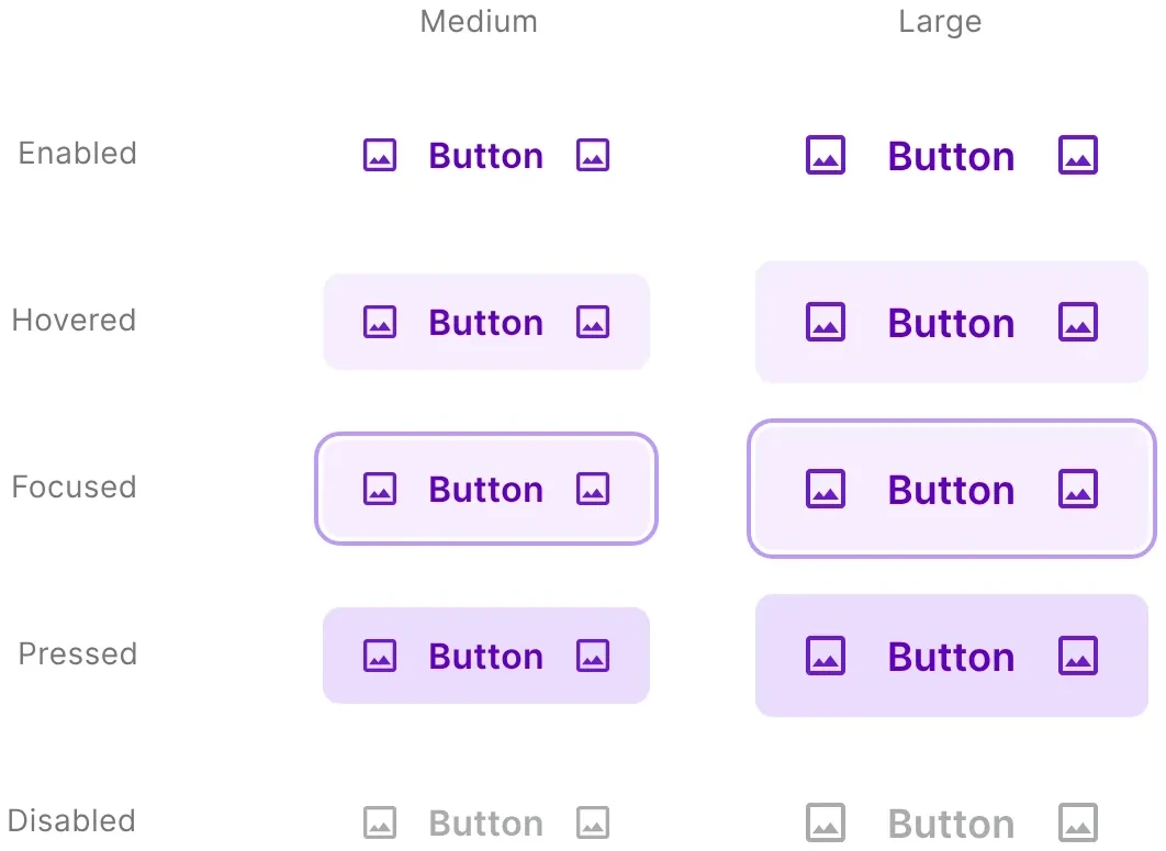
Text button
Text button
Segmented, standard: Two to five segments
Segmented, standardTwo to five segments
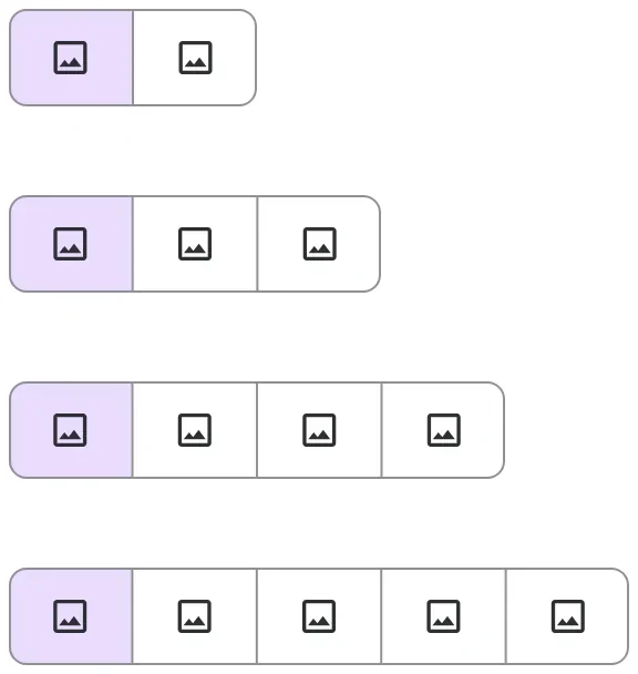
Segmented, icon
Segmented, icon
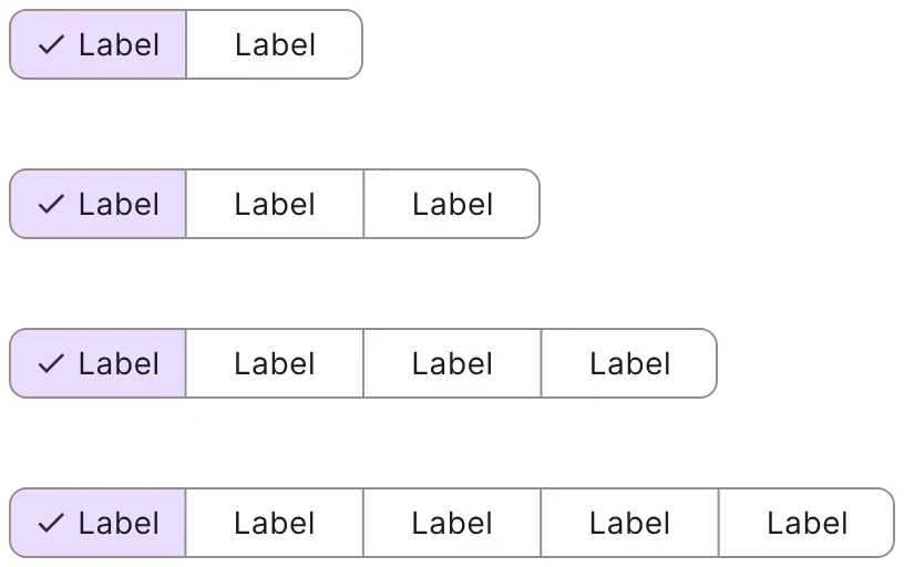
Segmented, compact
Segmented, compact

Communication

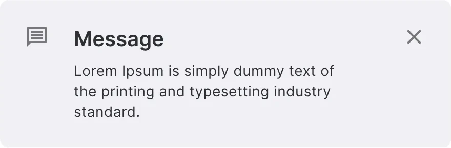
Alert: neutral
Alert: neutral
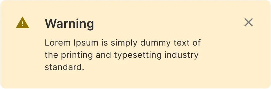
Alert: warning
Alert: warning
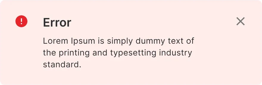
Alert: error
Alert: error
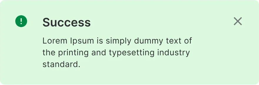
Alert: success
Alert: success
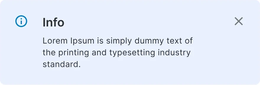
Alert: info
Alert: info
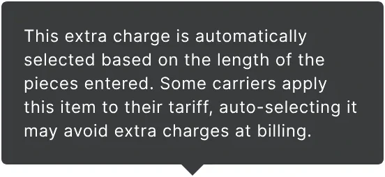
Tooltip
Tooltip
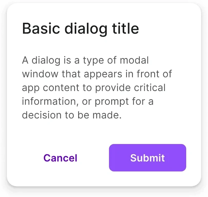
Dialog: basic
Dialog: basic
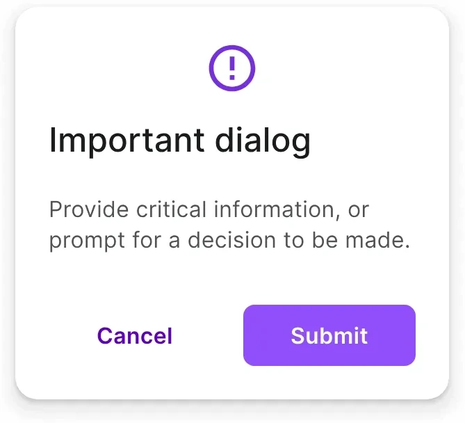
Dialog: important
Dialog: important
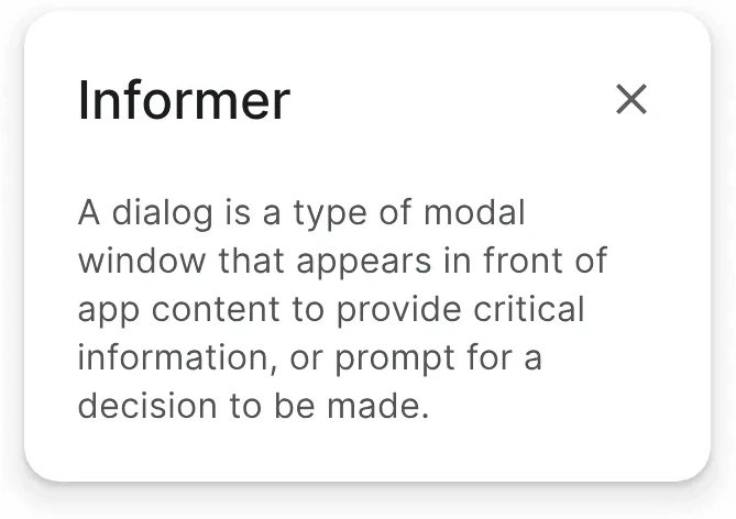
Dialog: informer
Dialog: informer
Badges: Dot and digitalBadges: Dot and digital
BadgesDot and digital

Inputs and selection

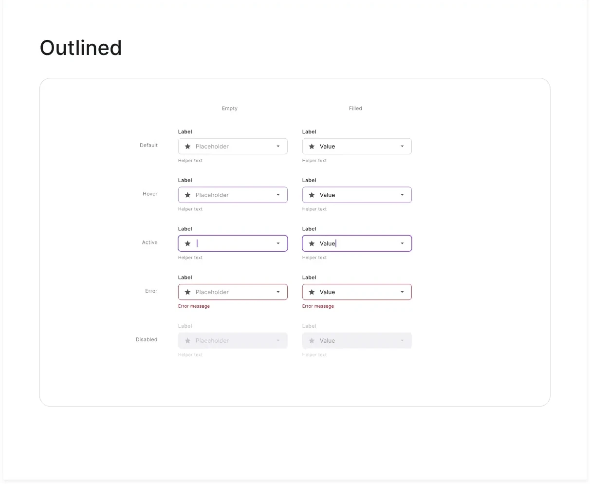
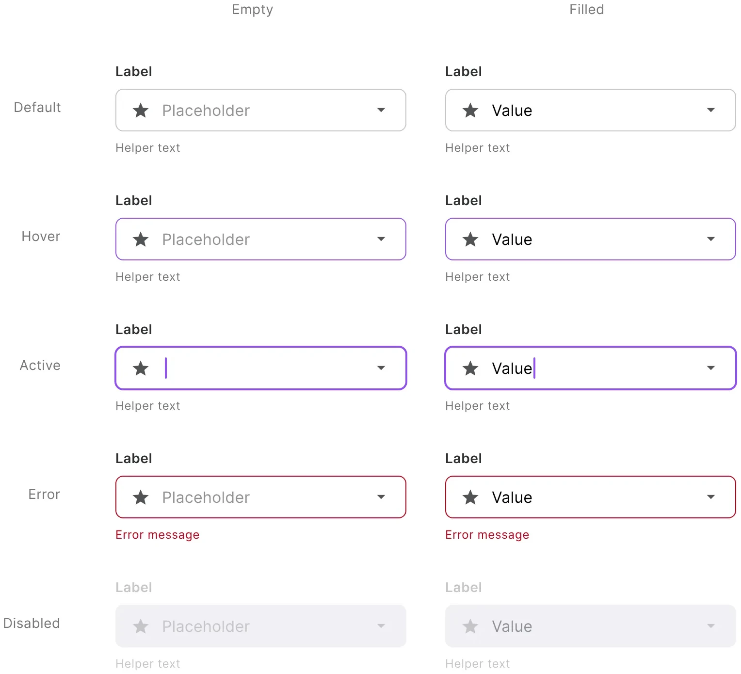
Text field: Empty and filled × default, hover, active, error, disabled
Text fieldEmpty and filled × default, hover, active, error, disabled
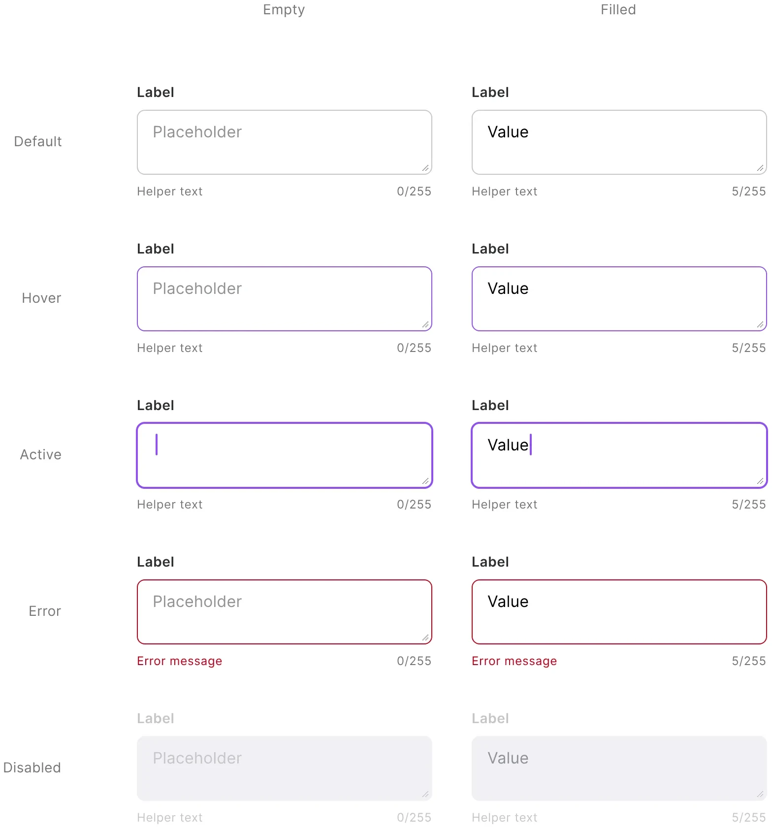
Text area
Text area
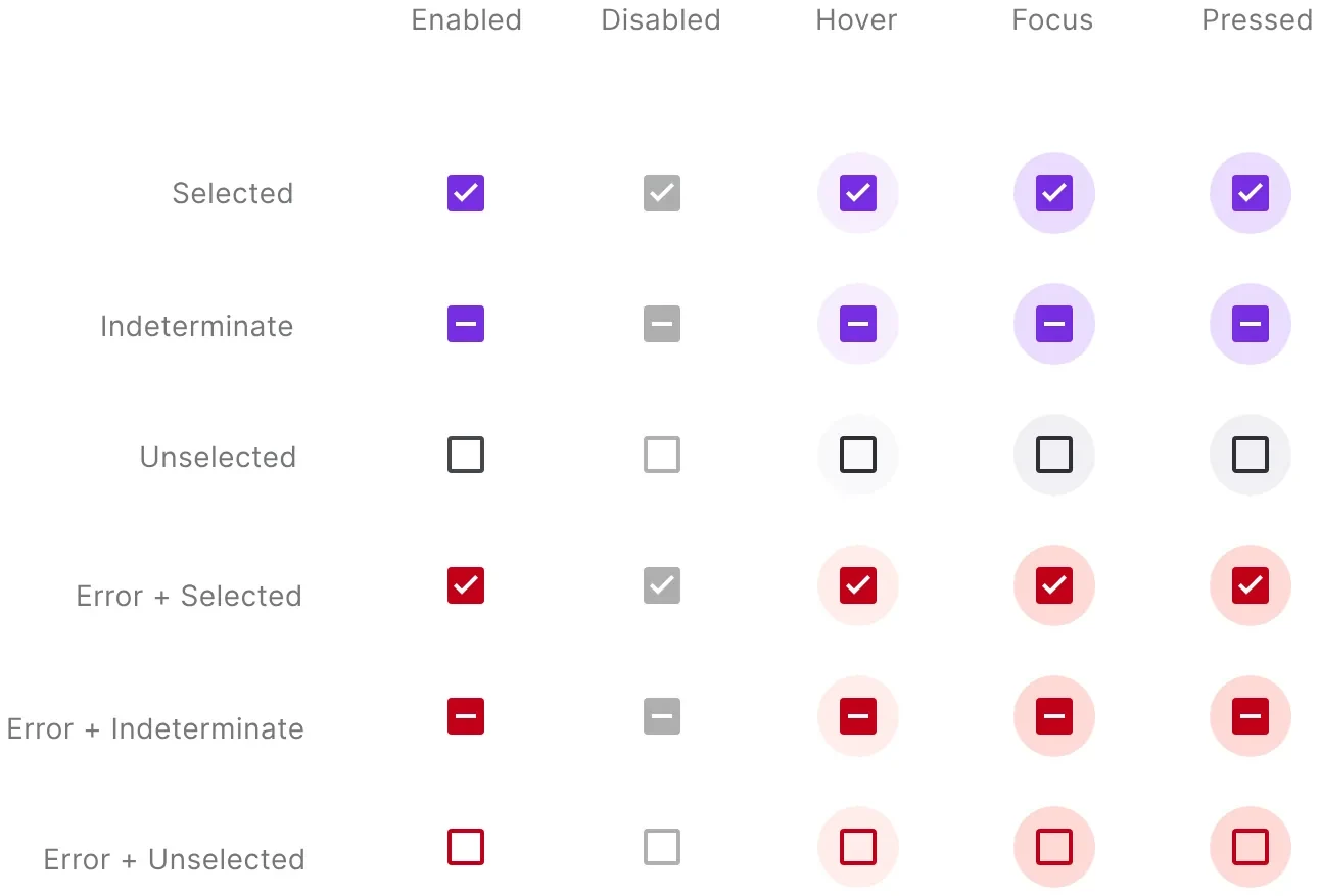
Checkbox: Selected, indeterminate, unselected and their error states
CheckboxSelected, indeterminate, unselected and their error states
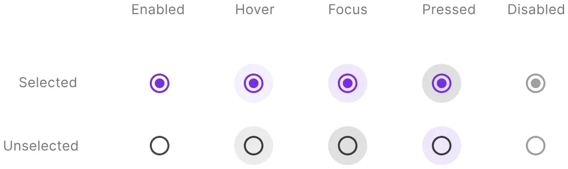
Radio button
Radio button
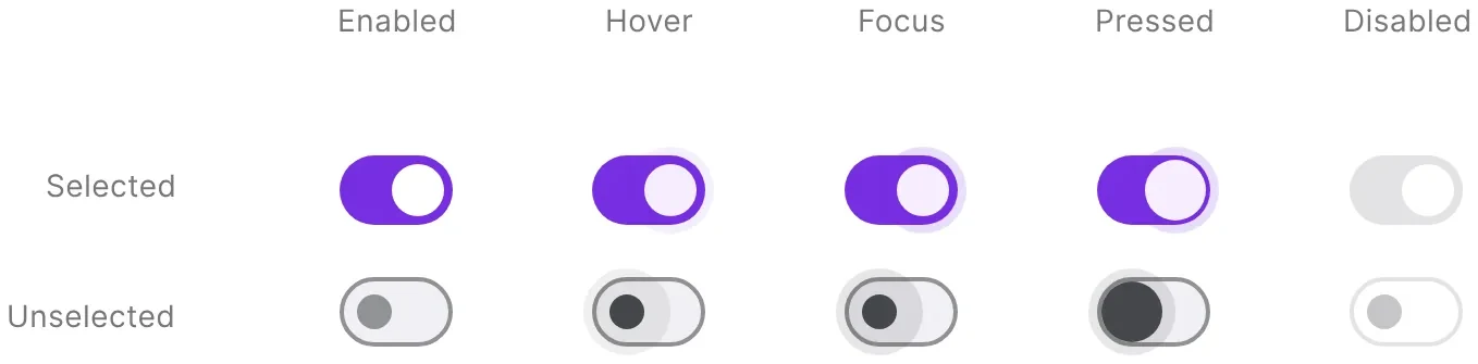
Switch
Switch

Navigation

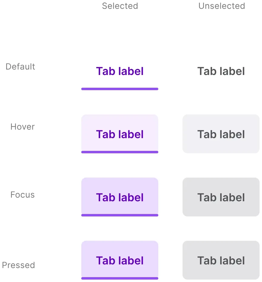
Tabs: Default, hover, focus, pressed
TabsDefault, hover, focus, pressed
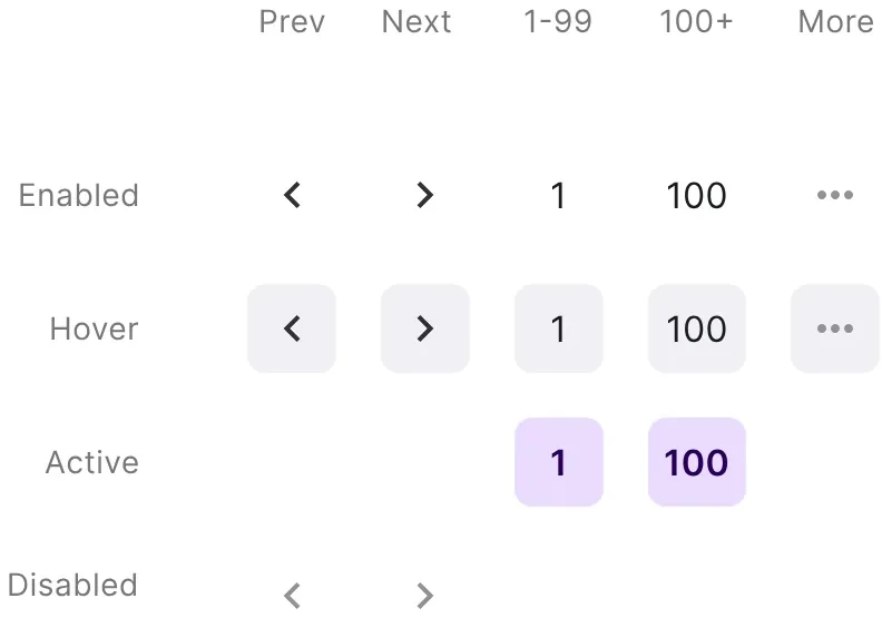
Pagination elements
Pagination elements
Pagination: Basic and extendedPagination: Basic and extended
PaginationBasic and extended
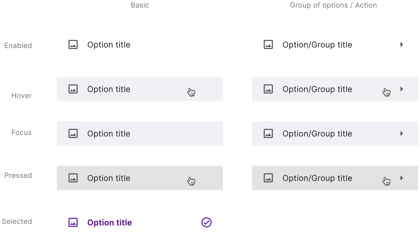
Menu items: Enabled, hover, focus, pressed, selected
Menu itemsEnabled, hover, focus, pressed, selected

Brand and website

The system for Produktiv’s own site.

Logo: Wordmark and P mark
LogoWordmark and P mark
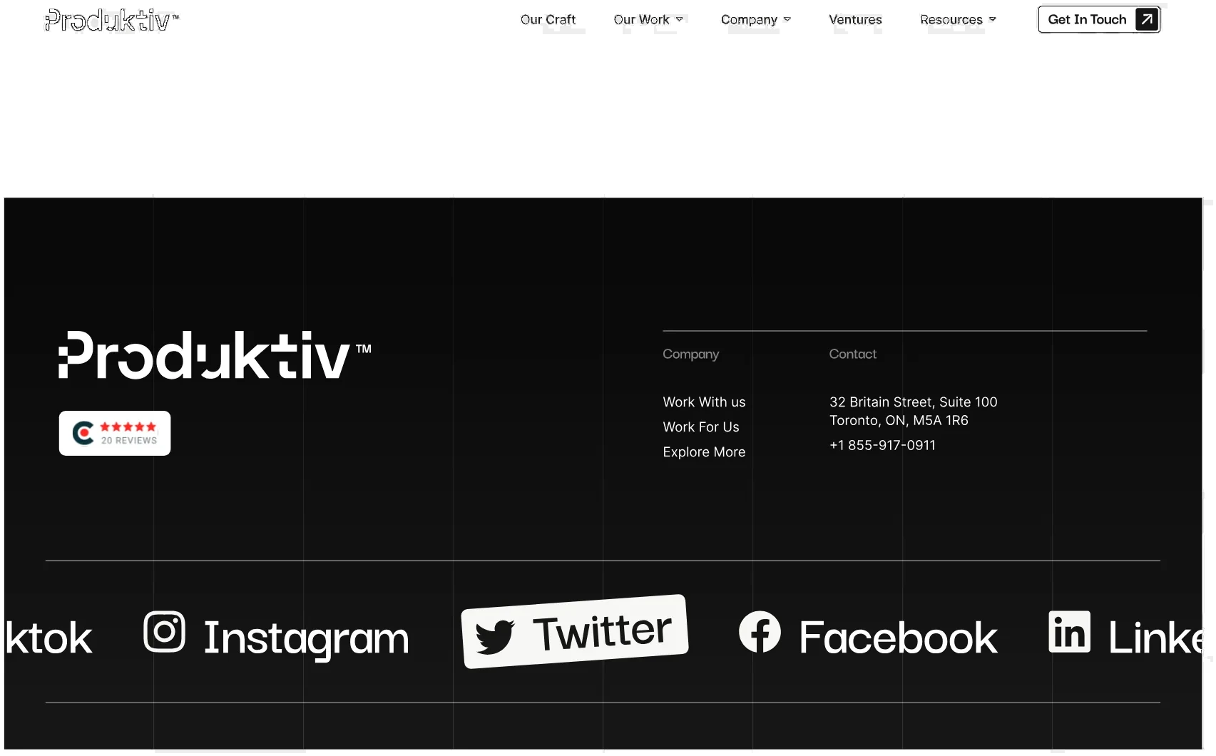
Navigation and footer
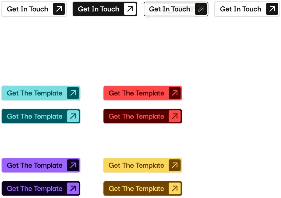
Buttons: Get in touch and template CTAs
ButtonsGet in touch and template CTAs
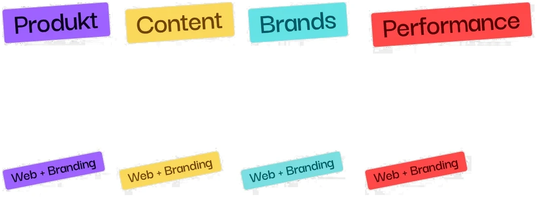
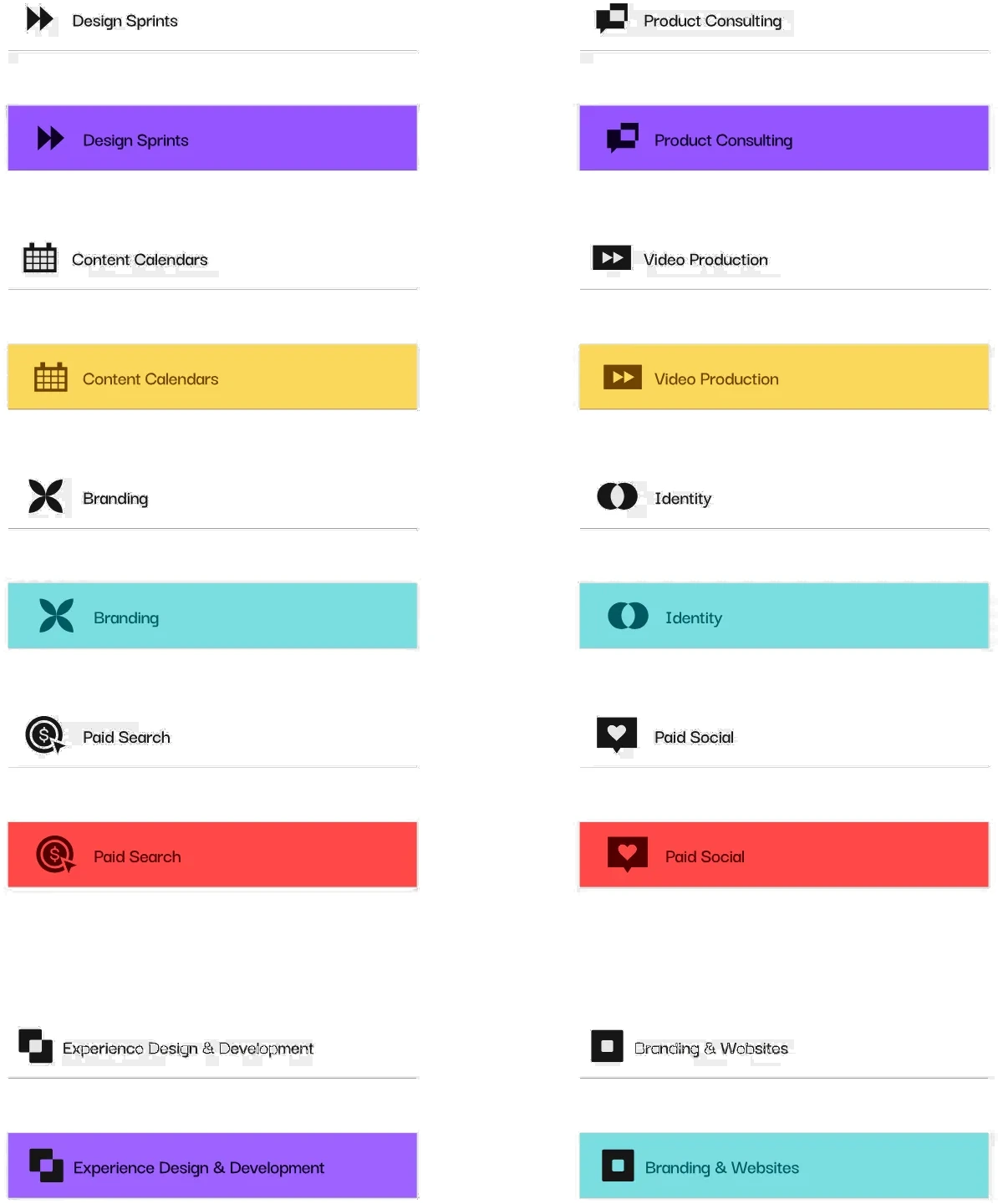
Tags: One colour per service line
TagsOne colour per service line
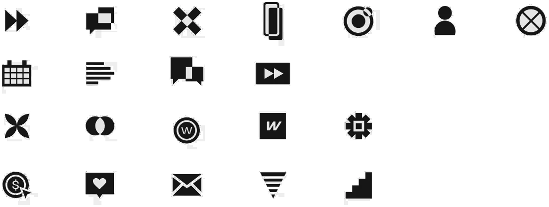
Service icons
Service icons
Pod page icons
Pod page icons
Service page widget: Icon and filled variants for every service
Service page widgetIcon and filled variants for every service
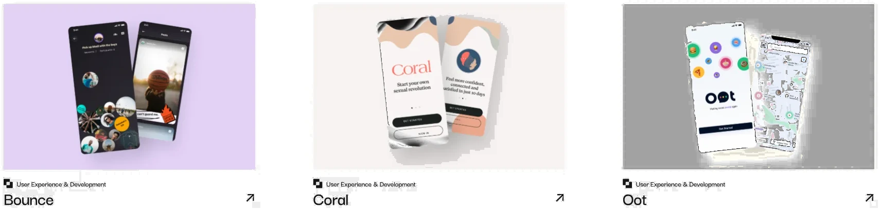
Projects widget
Projects widget

03 · Client work · Canadian Blood Services

Canadian Blood Services

Lots of people register for the Cord Blood Bank on their phone, so the components had to be responsive across desktop and mobile, and as accessible as possible for every audience.
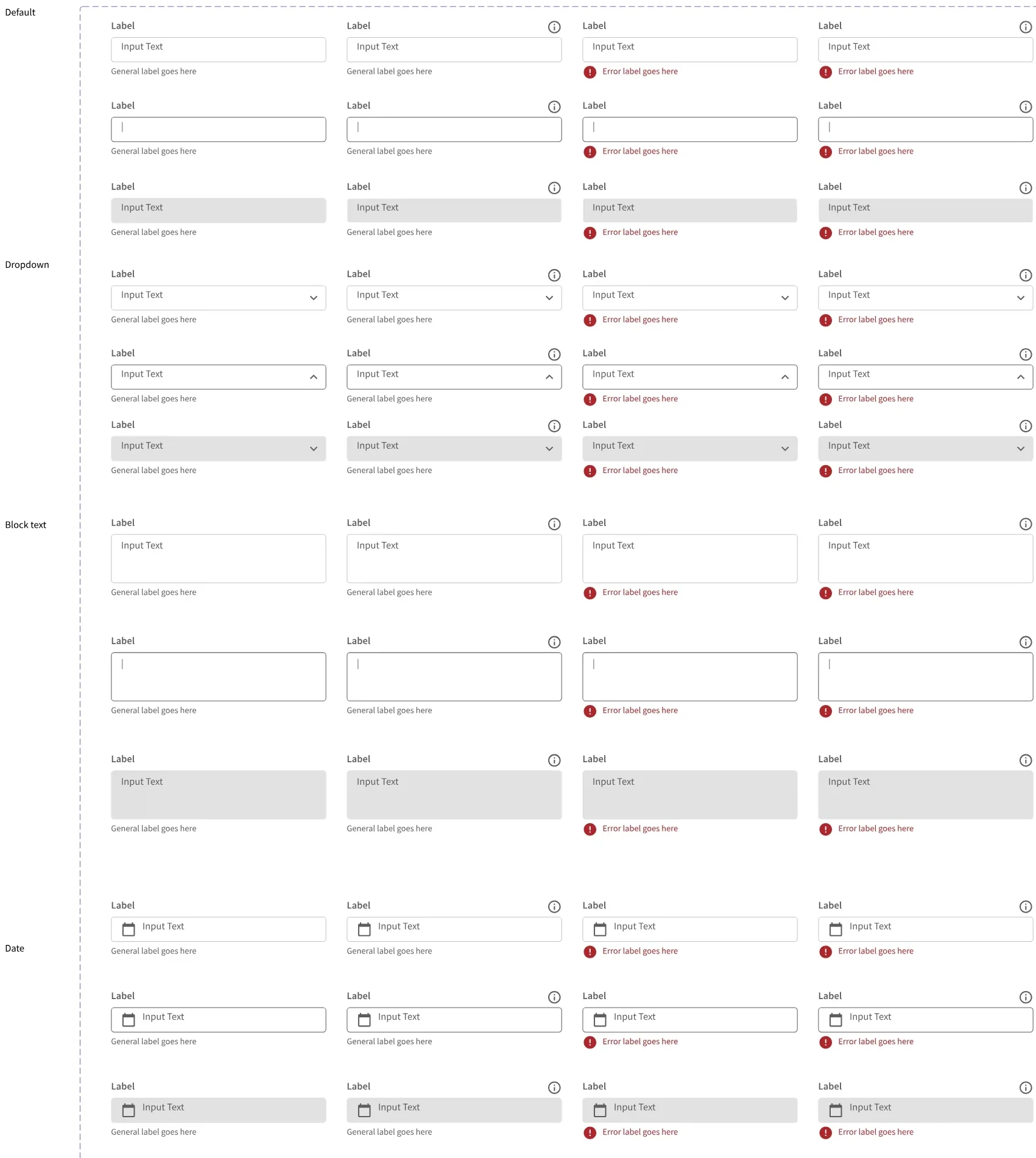
Input fields: Text, dropdown, block text and date × validation states
Input fieldsText, dropdown, block text and date × validation states
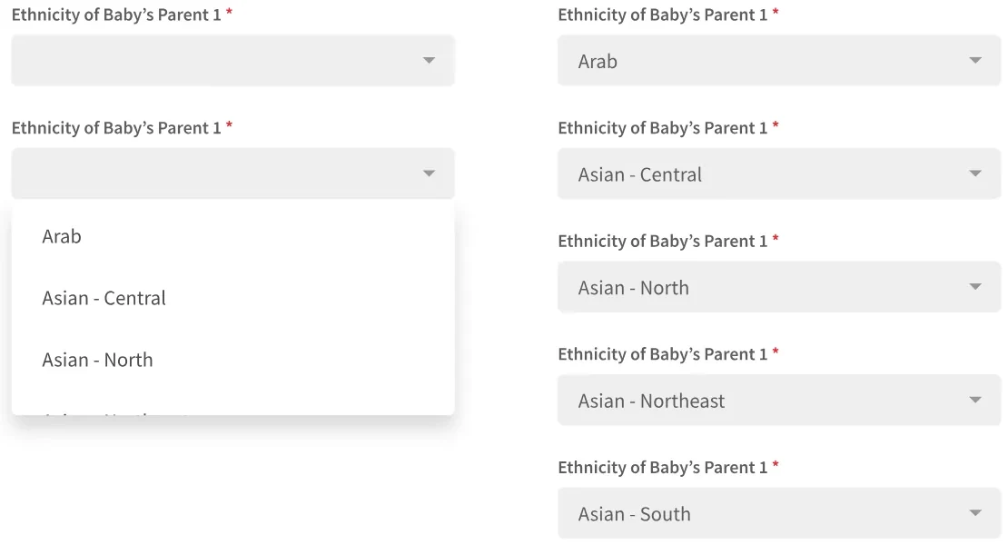
Long answer lists
Long answer lists
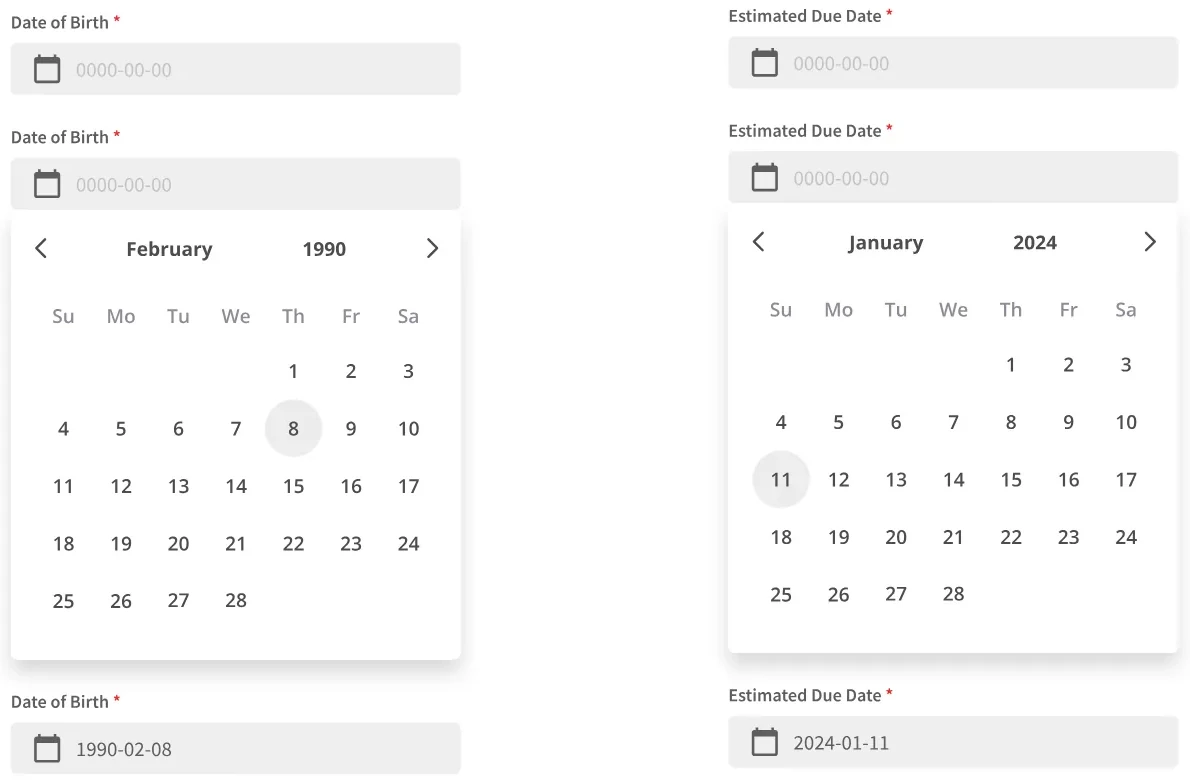
Date pickers: Date of birth and estimated due date
Date pickersDate of birth and estimated due date
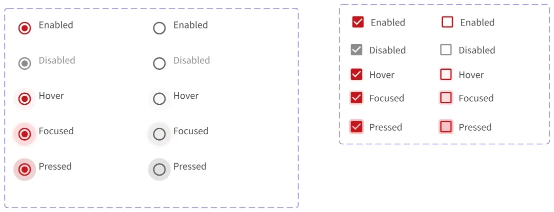
Radio and checkbox
Radio and checkbox